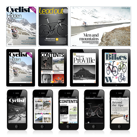
It was very nice to see one of my projects up on stage at the EDO talk this week – Cyclist Magazine App. It was being used an example of how well considered design can create strong templates in HTML products. Or as Ant Miller of Clearleft said in his post: “It’s structure heavy, technically, but this is just a scaffold for some really beautiful design.” Thanks! That is what I want people to think when they see my products. (http://clearleft.com/thinks/pointstopixelsatedo/)
Jonathan Clayton-Jones (JCJ) presented Cyclist and Evo as apps he admired – which was very gratifying. There was a little accidental ambiguity in the presentation as Kaldor were the SAS providers (software as service). The creative was myself and our HTML guy Ali Driver at for Dennis Publishing and, obviously, Cyclist’s editorial team. It was project managed at Dennis. In terms of structure, look, feel and interaction – that was us.
The talks by Jonathan Clayton-Jones (Grazia and now Kaldor), Alex Breuer (The Times and now creative director at The Guardian) were very instructive. I thought most important point was that with strong typography and grids applied to HTML products can look and behave beautifully, serve there content elegantly and look after their users and their brand.
I also enjoyed Alex Breuer’s closing points:
1. We are not the only designers – Bruce Mau said something along these lines this a long time ago and I wasn’t sure what he meant back then.
2. We are now developing software – A very useful way of thinking for all us creatives.
3. Always have an analogy. It’s like when you are being presented with your own work and… It’s like that thing Bruce Mau said: We no longer design alone.
