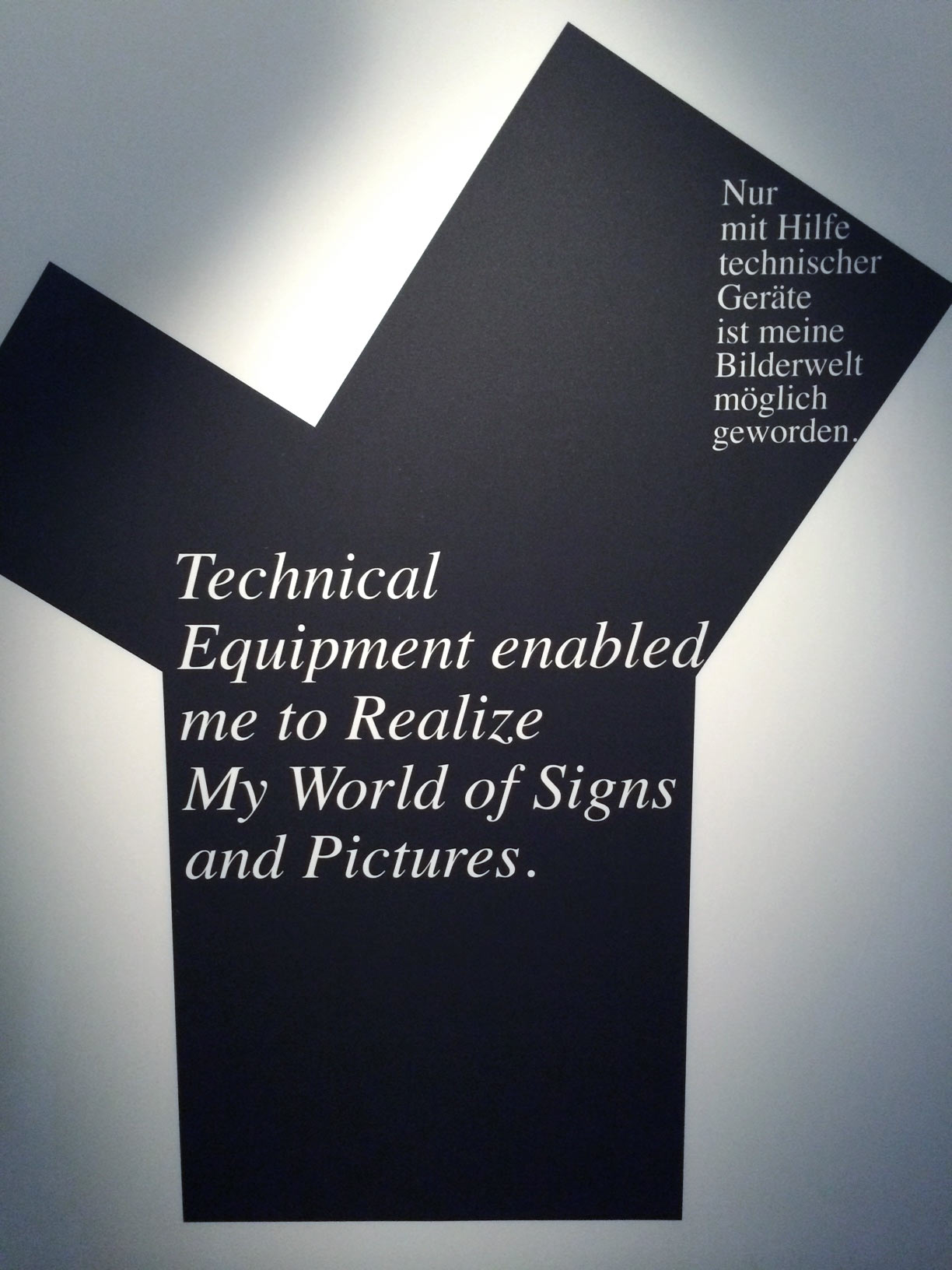
“Technical equipment enabled me to realise my world of signs”
Sitting in the Museum Fur Gestalt, Zurich, watching footage of pre-eminent typographer Wolfgang Weingart in his archives it was hard not to be moved. A man sits surrounded by his life’s work telling the stories of how each artefact came to life.
Weingart’s work connects the Swiss School of Lars Muller-Brockman and Emile Ruder to everything that comes after. By combining modernism and a freer, more explorative spirit he created a new expressionistic form for the written word. It was both functional, wild, and it has stood the test of time. For anyone who owns the monogram the retrospective was a long time coming.
Designing things that are both fit for purpose and beautiful is something most clients and practitioners say they want to achieve but rarely do. Sometimes it’s because a projects requirements are too many, or not simply not appropriate. Sometimes it’s the limitations of technology – for instance, is there a need for mobile products to stand the test of time?. Sometimes it’s because the makers and commissioners are not the kind of designers they think they are: they are fans rather than talents, talkers rather than makers.
To paraphrase Weingart maybe some designers don’t have “a world of signs to realise”. In order to make things that are good you have to have something you want them to be in the first place. Designing without preconceptions might be good methodology but working without an aesthetic is hopeless.
Weingart’s aesthetic was a precursor to the natural aesthetic of our world of digital tools. Tone, texture, blocks, patterns. Although it was born of playing with the physical processes at his disposal it is hard to see it away from the context of the digital design spaces which are now so commonplace to us. Some of the schools that came after had new tools that, coincidently, lead them to celebrate his aesthetic & a new conceit for “movable type”. What I love and what I see when I look at his work is a need to invent and to entertain the eye. A belief in in heritage combined with a need to innovate. But most importantly: An understanding of the intangible relationship between looking and reading.
As Weingart gesticulated I caught a glimpse of his Max Bill watch peeping out from his cuff. It’s an immaculate piece of Bauhaus product design: minimal but still very human. It was made between an aesthetic and a need. Some years ago I was given one for my birthday by my Mother. Needless to say I love it. It was a sign in a “world of signs”: make something with a vision & it might be good forever.
