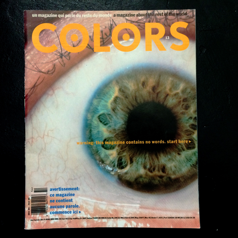
It sounds mad in this day and age but only a handful of people get to work with for a master. On Tuesday night at the the EDO event in London Fernando Gutiérrez talked about his time with Tibor Kalman and the legendary pictures only issue of Colors magazine. I actually heard someone behind me gasp when a few of the pages came up. It was obviously news to him in away to many of us it, and Kalman, are part of art and design folklore.
Kalman’s work seems entrenched in the notion that pictures can do all the work. Nowhere did he prove this more than issue thirteen of Colors. Whilst talking about the process of editing and designing with Kalman, Gutiérrez said “The pictures became words”.
He then went on to talk about his six years with Pentagram and as a Creative Director and partner on Matador. An elegant and enviable body of work.
After the usual digital/print questions I had to ask him about something that I deal with a lot – How do you talk to clients about the subtleties of typefaces?
“I don’t. I say ‘this is a good font. It won’t let you down’”.
It got a big laugh – because it was funny – but to me that is an extremely valuable piece of advice. Not every client wants to hear why a font is appropriate – but a good one knows when it is. By the same measure there are not many products that can have the pictures become the words – but a good product acknowledges that we look before we read.
