Archives for category: Digital Magazines

worksheets -ideasformsfunctions.com


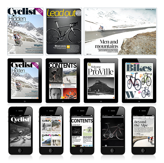
I have been developing a short worksheet over the passed year or so for certain jobs. Its purpose is to collate the different influential factors on a rebranding or redesign of content brands – in this instance one thats sits on multiple platforms. It I have been using it in lieu of user research but I think it would sit well with it or before it on many of my more recent jobs. The most recent time I used it I felt I didn’t have a strong enough starting point before I undertook the trust part of the work. We shred the document between the key figures of the job and I quickly got back this great picture of where we needed to go.


Read the rest of this entry »

ipad-ideasformsfunctions.com

This is a discussion I had over recent weeks with my colleague Dan Ichimoto of Heaps Magazine. A culture magazine made in New York and published on iPad for a Japanese audience. He wanted to know what was going on in London with publishing for digital mags.

Read the rest of this entry »

emotemedia_logo

Or, why user-focused questions are the only way to make successful products

What could content brands be asking themselves about their customers before, and whilst, making and iterating their products?

I work with both large and small brands and I think that design that focuses on the user is neither new nor the exclusive territory of big brands with research budgets and huge dev teams. Every scale of operation can make a picture of its customers and their needs. What is important is that teams are analytical and involved in ways of thinking about the situations in which people buy and use their products to be successful.

Read the rest of this entry »

cyclist-grid-for-web

It was very nice to see one of my projects up on stage at the EDO talk this week – Cyclist Magazine App. It was being used an example of how well considered design can create strong templates in HTML products. Or as Ant Miller of Clearleft said in his post: “It’s structure heavy, technically, but this is just a scaffold for some really beautiful design.” Thanks! That is what I want people to think when they see my products. (http://clearleft.com/thinks/pointstopixelsatedo/)

Read the rest of this entry »

monotype

Had the great pleasure of visiting Monotype’s Clerkenwell office last week. We met with Than Hoang, Thomas Elliot and the type designer Toshi Omagari. We discussed numerous subjects including Etext fonts, kerning pairs, and their very clever Typecast system.

Read the rest of this entry »

IMG_3166A fascinating and fun day at the Digital Magazine Awards (#dma13) and the “Un-conference” before hand. Spoke to all sorts of interesting people about what is going on in the industry.

Here are some of the things we saw or that came up:

Read the rest of this entry »